Look up ridgeline density plots, try the quantile dot plots next, and layer in animations. It'll step up data visualizations for distributional data.
@jpdominator Says:
Annual mean low? Yearly average low? I’m confused.
@BoomRoomFive Says:
This is the kind of thing I'd spend way to much time trying to solve. Glad I'm not alone. I find myself saying more and more these days, Why can't I do this - it's a programmable computer for Hell's sake!
@emil.steiner Says:
This is just a violin plot with less information
@ski3r3n Says:
gantt chart?
@latrapa918 Says:
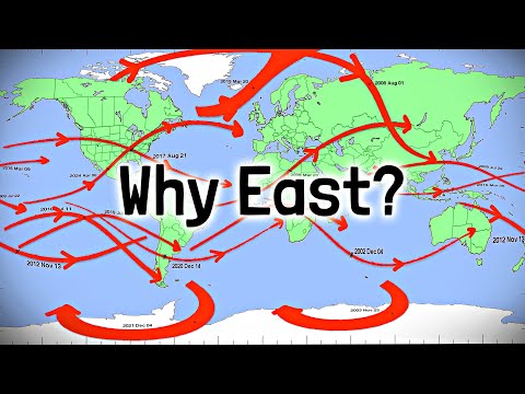
3:16 AROACE
@General12th Says:
Hi Henry!
@enderoftime2530 Says:
Minitab
@_the_bomb Says:
What I learned from this is you do not know how to use either MatPlotLib (Python) or ggplot2 (R).
Isn’t it time you open yourself up to the next tier of graphing?
@hawladarnazrulislam2685 Says:
You are truly a skilled content creator.
@GamerTA13 Says:
0:23 LONDON ONTARIO MENTIONED
@kijeenki Says:
this is why you write your own chart program
@Sci0927 Says:
3:10 minnesota!!!!
@Qaos Says:
I think the best most have for something like this is box and whisker charts
@XZenon Says:
Aside from the obvious solution, which is matplotlib, one could submit a feature request to the LibreOffice GitHub.
@RafaelB.M. Says:
3:01 don't get me wrong, I'm all for your plot demands here, really love your work, but please tell me you forgot about Indonesia having most of its territory below the equator, and didn't do that Asia bar on purpose to get more engagement from nitpickers like me 😂
@bearcrimes Says:
im pretty sure this can be made in power BI without too much effort
@elliotsmith9812 Says:
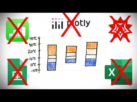
HISTOGRAMS! Excel is crap at histograms.
@Tudo11927 Says:
2:01 I guess we should start using Kelvin for every temperature statistics from now on (x
@durdleduc8520 Says:
i'm curious -- are these "stacked range charts" not just box and whisker charts with a slightly different visual design? those are supported in a lot of spreadsheet programs.
@Amber2192 Says:
Hiii
@TinyBit-q6q Says:
pretty sure R has boxplots like those
@Strav9 Says:
I keep having issues with receiving the one of the original drawings.
I signed up in November on Patreon on the required tier, and got zero feedback on the app.
How should I proceed
@swayson5208 Says:
should be pretty simple to use an LLM to help write the code for this in matploitlib
@e.p.s.9037 Says:
minuterant
@JarkeDarnit Says:
Question:
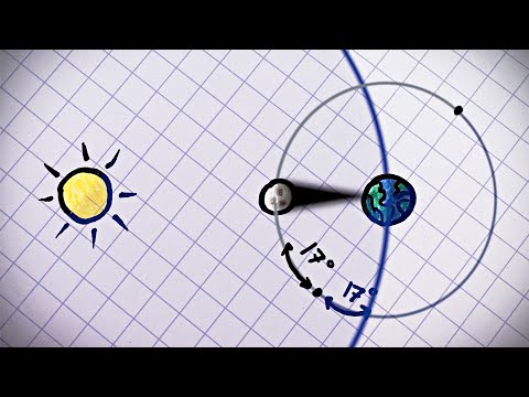
If a Slinky is stretched vertically, with its bottom end in Earth's atmosphere (under the influence of gravity) and its top end far into space (where there’s no gravity), what would happen to the bottom when the Slinky is released? Would the bottom "hover" in place like in the classic Slinky drop, or would it fall immediately due to Earth's gravity? How would the lack of gravity at the top affect the motion of the entire Slinky?
@tamara3984 Says:
I used to work in document production and we had to draw over bar charts and cheat to create these charts. So I am on board with getting software companies to create these charts.
@lemon_twist12 Says:
Proportional serif
@DavidSommer-pw7fv Says:
Since LibreOffice is open source, theoretically, one could add features like what you suggest.
@nathanpieper3859 Says:
2:35 made me jump.
@acy9901234 Says:
Box plot?
@interlooper83 Says:
You mention Mathematica, but all your examples are novice level excel hacking. You can do this with horizontal lines, shading and plot regions simple as pie in Mathematica. Git gud.
(I mean I agree a simple function would be better, but for a physics centric channel this just showed me you don’t like getting into the low level plotting options of your technical analysis programs.)
@ThePixelPear Says:
I want this
@evanbasnaw Says:
So in this specific case, everything could be fixed by standardizing on Kelvin for temperature.
@asailijhijr Says:
This is a reskin of a box and whiskers chart.
@analyticsbyandy Says:
Love it! Another chart that doesn’t seem to be easy to do in Excel/R etc is icon arrays, no way so far as I can see.
@asdfghyter Says:
what about box charts? aren’t they a standard way of showing the same data?
@AmenProletar Says:
This kinda exists in Minitab when you want to do an X bar/ R chart.
@SergiiNechuiviter Says:
Did you try candles to represent this information?
@FlashMeterRed Says:
Quaternary bar chart like that is an option in graphpad prism
@harryh-i5y Says:
This takes like zero seconds to make in excel. Just create a table that sets out the differences and let excel graph them how it likes.
It's nothing compared to a waterfall chart. That is mildly challenging to create. Still something I expect of a second year graduate.
@victoriab8186 Says:
Thank you, this is both great and terrible because I’ve learnt of a great new chart and now I want it and can’t have it
@APieceOfCheesee Says:
What if one portal in bigger then the other
@nitaiperez Says:
Um, this is easy to do in google spreadheets. Just add a transparent section at the bottom, spacing it
@curtiswfranks Says:
What about a box-and-whisker plot? It is kinda close.
@iconicbones251 Says:
What if the attached a portal to a portal like a chain?
@drummondF Says:
skill issue.
@SolidTux05 Says:
Isn't a whisker plot the right tool here? That exactly is meant to show average, derivation and the range.
@vpluntky Says:
This is why you use matplotlib and not excel i guess? X-D


LATEST COMMENTS